
Web Accessibility

 High Quality Website Design & Development at Low Prices | VITSOLS

Web Accessibility: Making the Internet Inclusive for Everyone

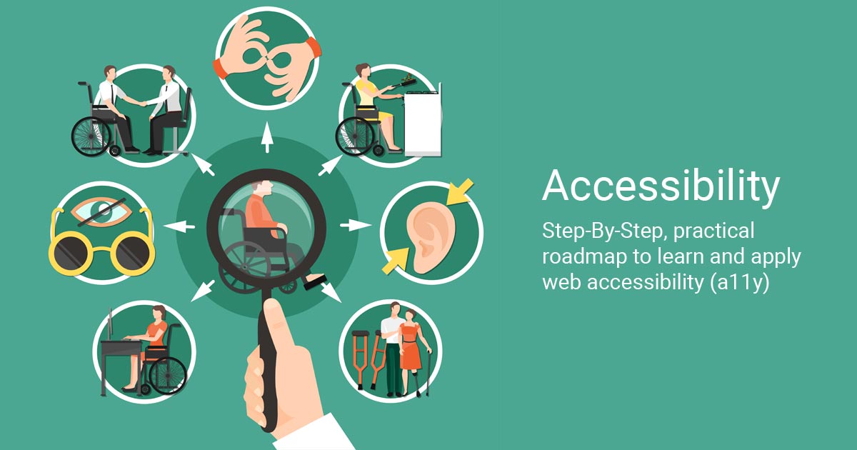
What Is Web Accessibility?

Web accessibility means designing and developing websites so that people of all abilities and disabilities can use them effectively. An accessible website ensures that users with visual, auditory, motor, or cognitive impairments can perceive, understand, navigate, and interact with its content.


Why Accessibility Matters

  • Inclusive Experience: The web should be usable by everyone, regardless of physical or cognitive abilities.

  • Legal Compliance: Many countries enforce accessibility laws (such as the ADA in the U.S. or the RPwD Act in India). Non-compliance can lead to legal action.

  • Better User Experience: Accessible design benefits all users, including those on mobile devices, in noisy environments, or with slow internet connections.

  • SEO Benefits: Search engines favor well-structured, semantic content, which overlaps with accessibility best practices.


Core Principles of Web Accessibility (POUR)

The Web Content Accessibility Guidelines (WCAG) are built on four principles—POUR:

  1. Perceivable: Content must be presented in ways users can perceive (e.g., text alternatives for images, captions for videos).

  2. Operable: Interface components must be usable with a keyboard and provide enough time for interaction.

  3. Understandable: Content and navigation should be clear and predictable.

  4. Robust: Content should work reliably with assistive technologies like screen readers.


Key Accessibility Practices

  1. Use Semantic HTML

    • Proper headings (<h1>, <h2>, etc.)

    • Descriptive links (avoid “click here”)

  2. Provide Text Alternatives

    • Add alt text for images.

    • Offer transcripts and captions for audio/video.

  3. Ensure Keyboard Navigation

    • All functionality should be available without a mouse.

    • Provide visible focus indicators.

  4. Color & Contrast

    • Maintain a minimum contrast ratio (4.5:1 for normal text).

    • Don’t rely on color alone to convey meaning.

  5. Forms & Labels

    • Associate <label> elements with inputs.

    • Provide clear error messages and instructions.

  6. Responsive & Flexible Design

    • Support screen magnification and reflow.

    • Avoid fixed font sizes.


Tools to Check Accessibility

  • WAVE (browser extension)

  • axe DevTools

  • Lighthouse (Chrome DevTools)

  • NVDA or VoiceOver for screen-reader testing.


Steps to Get Started

For a detailed, step-by-step implementation guide, visit
👉
https://www.vitsols.com/blog.html

Here’s a quick overview to begin:

  1. Audit your current website using automated tools and manual testing.

  2. Prioritize issues based on WCAG 2.1 Level AA guidelines.

  3. Train your design and development teams on accessibility standards.

  4. Incorporate accessibility into every stage of design, development, and content creation.


Final Thoughts

Web accessibility is not just a technical requirement—it’s a commitment to equal access and digital inclusion. By building accessible websites, you not only comply with legal standards but also expand your audience and improve the overall user experience.

Start today: review your site, make incremental improvements, and embrace accessibility as a core part of your digital strategy.

CSS Image Sprites

Popular posts from this blog

Photo Optimization

Photo Optimization is necessary to allow a web page to load in the shortest amount of time possible. Fast loading time require small files. This article discusses the methods used for photo optimization. In an ideal world, a web designer could use the highest quality photos and have the webpage download lightening fast. Fast loading requires small file sizes for pictures. Unfortunately, there is a trade off between picture quality and file size. Web surfers are a notoriously impatient bunch. If a website takes too long to load, they will just click away and never come back. Computer monitors can only display images at 72dpi (dots per inch). So the first step in photo optimization is to reduce the resolution to 72 dpi. Large picture can be sliced up into smaller ones and the put back together on the web page. Each piece will be a very small file and together will load in a fraction of the time a single image file would load. Most graphic files contain information about the color palette...

Mobile Web Design: Tips and Best Practices

Mobile Web Design Trends For 2009 Web designers know that the industry involves plenty of change, and continuous adaption and development of skills is required in order to stay up to date. In the past few years, one of the biggest areas of change has been the amount of Internet users who are accessing websites via phones and mobile devices. As a result, Web designers have a growing need to be educated in this area and ready to design websites that accommodate this audience. Because designing websites for mobile devices brings some unique situations and challenges into play, the subject requires a strategic approach from the designer and developer. In this article, we’ll look at the subject as a whole, including current trends, challenges, tips and a showcase of mobile websites. Plenty of helpful resources and articles are also linked to throughout the post, so if you’re interested in learning more about designing for mobiles, you should have plenty of information at your fingertips. 1....

What is XHTML ?

XHTML is almost identical to HTML 4.01 with only few differences. This is a cleaner and more strict version of HTML 4.01. If you already know HTML then you need to give littel attention to learn this latest variant of HTML. XHTML stands for EXtensible HyperText Markup Language and is the next step in the evolution of the Internet. The XHTML 1.0 is the first document type in the XHTML family. XHTML was developed by the W3C to help web developers make the transition from HTML to XML. By migrating to XHTML today, web developers can enter the XML world with all of its attendant benefits, while still remaining confident in their content's backward and future compatibility. Developers who migrate their content to XHTML 1.0 will realize the following benefits: 1. XHTML documents are XML conforming. As such, they are readily viewed, edited, and validated with standard XML tools. 2. XHTML documents can be written to operate better than they did before in existing browsers as well as in new ...